Logo case study · 2025
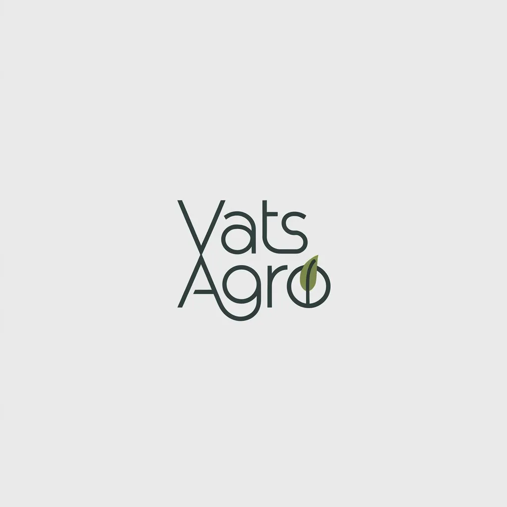
Vats Agro Logo
Vats Agro deals in organic produce, a category where customers look for honesty, simplicity and a connection to natural farming.
- Client
- Vats Agro
- Industry
- Organic produce
- Year
- 2025
- Scope
- Logo design & identity basics
The brief
What Vats Agro needed
Vats Agro deals in organic produce, a category where customers look for honesty, simplicity and a connection to natural farming. The brand needed a logo that felt gentle and trustworthy rather than loud, and that would sit well on packaging, labels and sacks as well as on social media and marketplace listings. It had to avoid the overused clichés of the category while still signalling organic quality.
The idea
How the mark works
The identity uses a minimal, soft script wordmark with no added illustration. Many organic brands rely on leaves, suns and farm scenes; Vats Agro instead lets gentle, handwritten-style lettering carry the message. The soft curves and relaxed rhythm of the script suggest care, craft and a human touch, as if each pack were labelled by hand. Keeping the logo minimal also makes it highly practical: it prints cleanly on kraft paper, jute and labels of any size, and leaves room for product information on packaging.
Colour
Earthy green and soft grey suggest fields, soil and natural materials, keeping the palette calm and honest.
Typography
A minimal soft script gives the brand a personal, handcrafted feel suited to organic, carefully grown food.
Where it lives
- Product packaging and labels
- Jute sacks and kraft bags
- Marketplace and social media listings
- Delivery boxes and invoices
More logos
More logos from the studio
Need a logo like this? Read how the logo design service works, or see the full portfolio.

Start a project
Want a logo that works this well?
Send a WhatsApp with what you need, a reference or two, and your deadline. Vikram replies personally.
