Logo case study · 2025
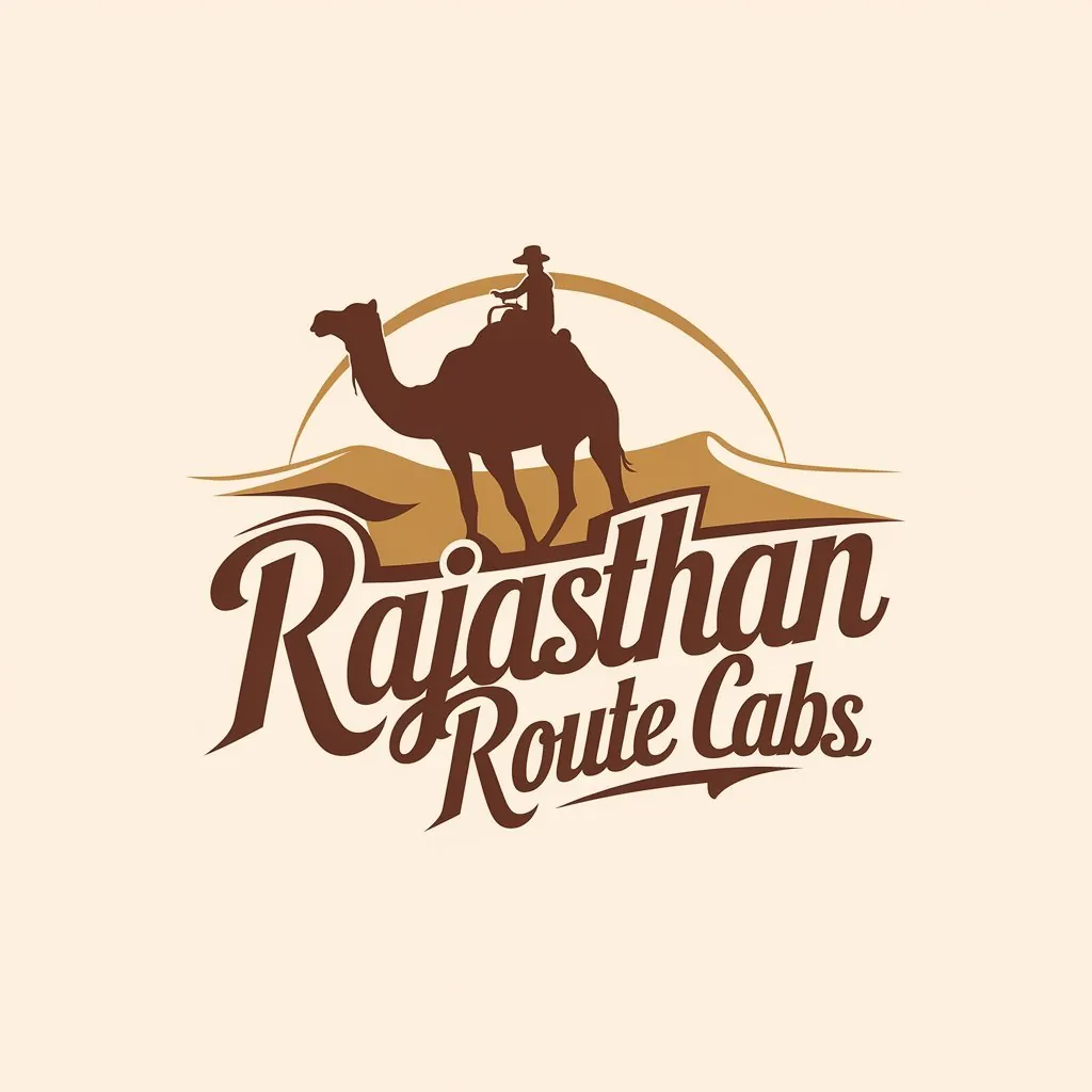
Rajasthan Route Cabs Logo
Rajasthan Route Cabs offers taxi services for travellers exploring the state, including outstation and tour routes.
- Client
- Rajasthan Route Cabs
- Industry
- Taxi and tour cabs
- Year
- 2025
- Scope
- Logo design & identity basics
The brief
What Rajasthan Route Cabs needed
Rajasthan Route Cabs offers taxi services for travellers exploring the state, including outstation and tour routes. Its customers are often tourists planning trips across Rajasthan, so the brand needed to feel rooted in the region and promise a journey rather than just a ride. The logo had to stand out on vehicles, in online listings and on WhatsApp, and stay easy to reproduce as decals and on printed material.
The idea
How the mark works
The logo pairs a camel silhouette with a brush-script wordmark. The camel is the classic traveller of the Thar desert, an image instantly associated with Rajasthan and with long journeys across it, making it a natural symbol for a cab service built around routes through the state. As a solid silhouette, it remains clear at any size and on any background. The brush-script lettering adds movement and a hand-made energy, suggesting the open road and the spirit of travel, while differentiating the brand from the plain block lettering common among taxi operators.
Colour
Desert brown draws from sand dunes and sandstone, linking the brand to the Rajasthan landscape its customers come to explore.
Typography
An energetic brush-script wordmark brings motion and personality while remaining readable on vehicles and screens.
Where it lives
- Cab door and bonnet decals
- Tour itineraries and receipts
- WhatsApp and Google Business profile
- Driver uniforms and visiting cards
More logos
More logos from the studio
Need a logo like this? Read how the logo design service works, or see the full portfolio.
Start a project
Want a logo that works this well?
Send a WhatsApp with what you need, a reference or two, and your deadline. Vikram replies personally.
